

A trade show floor is a lot of noise: dozens of booths, competing colors, and attendees walking fast with a limited amount of attention to spend. Good trade show graphics are what separate a booth people actually stop at from one that blends into the row.
None of this requires a professional design team. A handful of principles, applied consistently, make the biggest difference.
Start With One Message, Not a Full Pitch
A booth visitor typically decides whether to stop within a few seconds. Graphics that try to explain an entire product line in that window usually fail. The strongest booths lead with one clear idea, a name, a benefit, a single strong image, and let a conversation with staff fill in the rest.
Pick one headline message and build everything else around it
Save detailed specs and pricing for handouts or conversation, not the graphics
Keep the logo present but not competing with the main message
Build Displays That Work Together, Not Separately
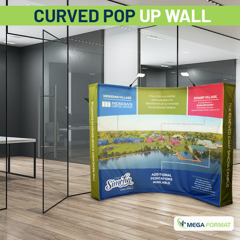
A booth usually combines more than one piece: a backdrop, a wall created with a trade show pop-up display printing, and often a stand for a retractable banner printing in NYC off to the side. These pieces read better as a set when they share consistent colors and type treatment, rather than each one designed in isolation.
A matching full-color tablecloth on the booth’s table ties the whole setup together, and it’s an easy detail to overlook when the focus stays on the backdrop and banners.
Design for the Angle People Actually See
Most attendees see a booth from an angle while walking past, not straight on. Double-sided pull-up banners placed near an aisle catch attention from both directions, and testing a design from a walking angle, not just head-on at a desk, catches layout problems a flat screen view misses.
Spatial design principles from SEGD, which studies how people move through physical spaces, apply directly here: graphics placed to intercept a natural walking path get noticed more reliably than ones simply filling open booth space.
Get the Type Size and Contrast Right
Text that’s readable on a laptop screen often isn’t readable from ten or fifteen feet away, which is the distance most attendees are at when they decide whether to approach. High contrast between text and background matters more than clever color choices for actually getting a message read.
Legibility standards from the U.S. Access Board, built around real viewing distances, are a useful benchmark even outside their original accessibility purpose. If a headline isn’t comfortably readable at a normal walking pace, it needs to be bigger.
Keep Color Consistent Across Every Piece
Brand colors need to match across the backdrop, banners, and tablecloth, not just look close. A color that reads correctly on a backdrop but shifts slightly on a banner printed by a different vendor makes a booth look assembled rather than designed.
Standards from the International Color Consortium exist to keep color consistent from file to finished print, which is exactly the kind of consistency that keeps a multi-piece booth looking cohesive rather than mismatched.
Design fundamentals from AIGA reinforce the same point from a layout perspective: a limited, consistent color palette reads as more professional than one that varies piece to piece.
Putting It All Together
Effective trade show graphics come down to a few repeatable habits: one clear message, consistent color and type across every piece, design tested from a walking angle, and hardware set up safely and quickly. None of it requires a bigger budget, just more intentional decisions before the graphics go to print.
Reusing a well-designed set across multiple events also pays off. Pull-up banners for trade shows built on durable hardware, paired with a high-quality table throw printing job that matches the same palette, can carry a business through an entire season of events without needing a redesign each time.
At Mega Format, we produce pop-up displays, retractable banners, and table throws together, which makes it easier to keep color and design consistent across an entire booth. Good trade show graphics start with treating the booth as one connected design rather than several separate pieces.
Planning your next trade show booth? Contact us to talk through your setup, or request a custom quote to get started.
