

Typography that looks balanced on a laptop can fall apart when it becomes an eight-foot banner or a wall-sized graphic. Typography for large format printing has to work at a distance, in motion, and often in visually busy environments. The goal is not simply to make type bigger. It is to make the message readable quickly.
Typography for Large Format Printing Starts with Viewing Distance
A font size has little meaning without knowing where the graphic will be installed. Text on a poster viewed from a few feet away can be more detailed than copy on a banner across a trade show aisle. For large-format printing in NYC, also consider how quickly people move past the sign. A storefront message has less reading time than an interior wall graphic.
Estimate the real viewing distance before designing. Prioritize the headline, offer, or brand name that must be understood first. Supporting information should stay secondary.
Build a Clear Type Hierarchy
Large graphics benefit from fewer levels of information. Give the main message the strongest size and weight, then create a visible drop to supporting copy. Too many similar font sizes create a flat design that is harder to scan from afar.
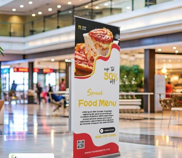
This matters with retractable banner printing and large-format poster printing in NYC because each format gives you different usable space. A narrow retractable banner usually rewards a shorter headline than a wide horizontal banner.
Watch Spacing as the Design Gets Larger
Kerning and tracking become more noticeable as letters scale up. Uneven spacing that seems minor on screen can look obvious when a word spans several feet. Adobe’s guidance on kerning and tracking explains how adjusting letter pairs or spacing across a word can improve type.
Line spacing matters too. Tightly packed copy is difficult to follow when viewers are standing rather than reading at a desk. Keep line lengths controlled and give multi-line messages enough breathing room.
Contrast Has to Survive the Environment
Judge color combinations in the setting where the graphic will appear. Low-contrast text may disappear under event lighting, behind glass, or against a detailed photograph. Use clear separation between type and background, and avoid placing essential copy over busy imagery unless the design creates a readable area.
Mega Format’s custom vinyl banner artwork guidance also recommends keeping text away from banner edges. That margin helps prevent important words from crowding finishing areas.
Test Before You Print
Do not approve typography only at screen size. Zoom out until the artwork approximates its intended viewing distance, then ask someone unfamiliar with the design what they notice first. Check final dimensions, safe areas, hierarchy, and spelling before using Mega Format’s artwork upload page.
Get Large-Format Typography Working at Real Scale
Good typography for large-format printing is designed for the place where people will actually see it. If you are unsure about dimensions, layout, or the right print format, contact us to discuss the project. For custom banners, signs, displays, or other oversized graphics, you can also request a custom quote and let our team help you plan the print around the space.
