
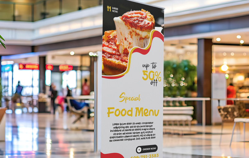
Most people walking past a trade show booth or storefront make a decision about whether to stop within a couple of seconds. Good retractable banner design is what earns that split-second attention, or loses it to the booth next door.
None of the tips below require a design background. They’re the same handful of principles that separate a banner people actually notice from one that blends into the background.
Size Type for Walking Distance, Not Screen Distance
Text that looks readable on a laptop screen can disappear at ten feet. As a rough guide, headline text should be legible from at least 15 to 20 feet away, since that’s the distance at which most people decide whether to walk closer.
Legibility guidance from the U.S. Access Board, built around real viewing distances and contrast, is a useful sanity check even outside its original accessibility context. If a headline isn’t comfortably readable while walking past at a normal pace, it needs to get bigger.
Use Color and Contrast to Do the Heavy Lifting
High contrast between text and background is what actually stops the eye, more than color choice on its own. Dark text on a light background, or the reverse, reads faster than mid-tone colors placed against each other, even when the mid-tone combination looks more sophisticated up close.
This matters even more for double-sided pull-up banners, where the design needs to hold up under different lighting depending on which side of an aisle someone’s approaching from.
Standards from the International Color Consortium exist to keep color consistent from a design file to the final printed piece, which matters here too: a banner proof that looks vibrant on a monitor can print slightly differently, so it’s worth reviewing a physical or accurately profiled proof before a full run goes out.
Placement Changes What Design Works
A banner’s design should account for where it will stand, not just what it says. Placed at an angle near foot traffic rather than flat against a wall, a double-sided retractable banner stand is visible from two directions at once, which changes how much the design can rely on a single dominant viewing angle.
Spatial design principles from SEGD, which focuses on how people move through and experience physical spaces, apply directly here: a banner positioned to intercept a natural walking path gets noticed far more reliably than one simply placed wherever there was open floor space.
Design for the Whole Season, Not One Event
A banner redesigned for every single event adds up in cost and design time. Building a flexible template, a strong headline treatment paired with a swappable secondary message, means the core design can be reused across a full season of pull-up banners for trade shows without starting from scratch each time.
Freestanding stands should also be secured properly wherever they’re placed. The National Fire Protection Association notes that unsecured freestanding displays are a common, avoidable hazard in high-traffic areas, which is as much a design consideration as an operational one, since a tipped-over banner draws attention for all the wrong reasons.
A well-chosen stand also affects how the design reads. A stand with a wider base and adjustable height keeps a banner sitting straight rather than leaning, which matters more than people expect since a slightly crooked banner reads as unfinished, even with excellent design work behind it.
Turning Better Design Into More Foot Traffic
A banner that stops people doesn’t need a bigger budget, it needs a clearer message, readable type, strong contrast, and a design built for how people actually move through a space. Small changes to layout and hierarchy usually make a bigger difference than a full redesign.
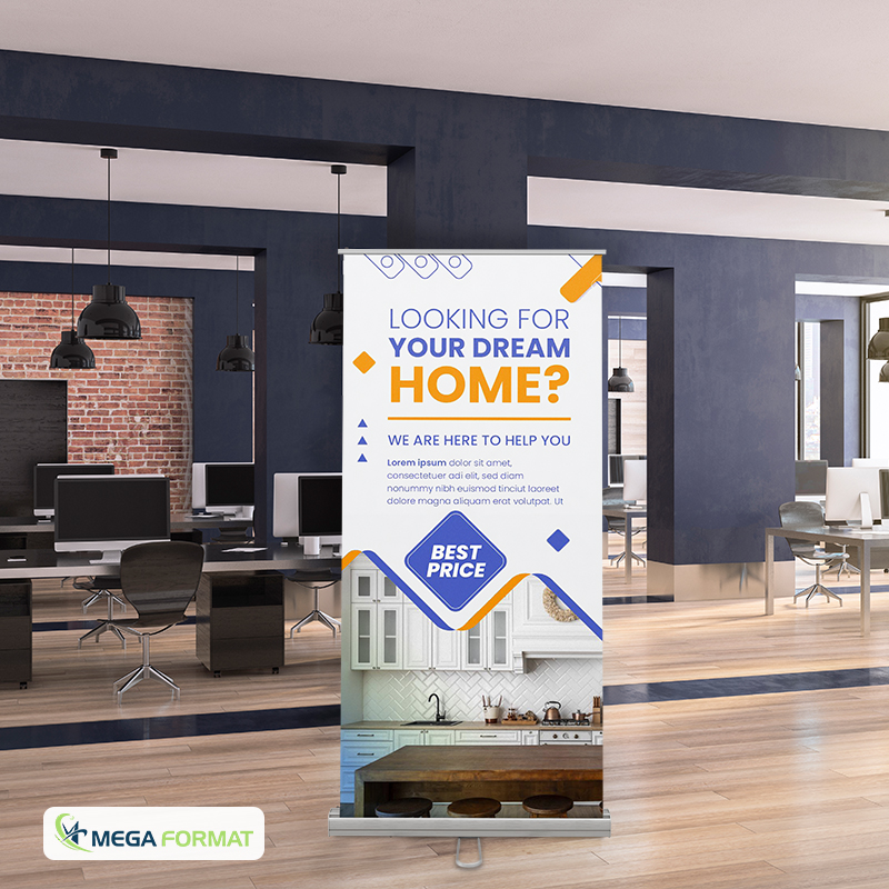
At Mega Format, we provide retractable banners come with design support to help messaging stay legible at a distance, and retractable banner printing in NYC turnaround times mean a redesigned banner can be ready well before your next event. We also provide retractable banner double-sided printing is also available for anyone who needs a design that reads clearly from two directions at once.
Ready to redesign your banner? Contact us to talk through layout options, or request a custom quote to get started.
