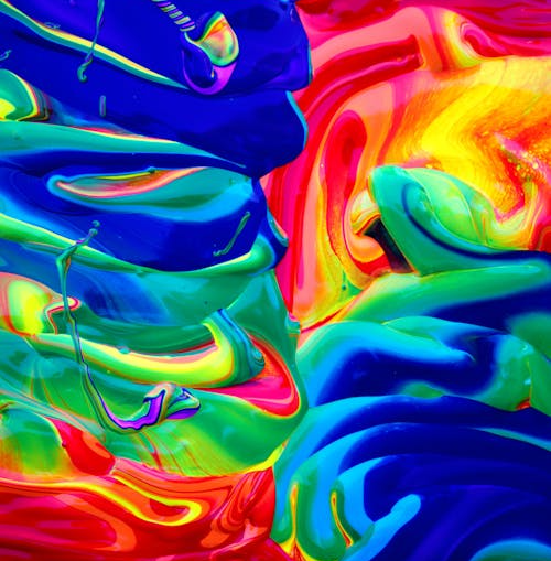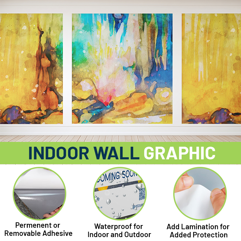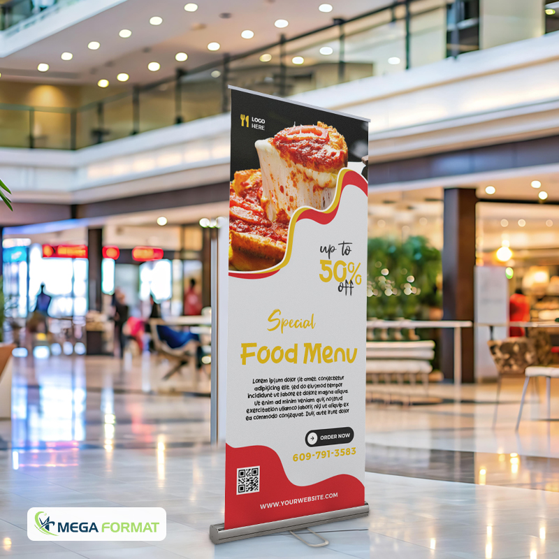
Color doesn’t just catch the eye, it shapes perception, drives emotion, and influences purchasing behavior. In large format printing, where visual communication takes center stage, color becomes a tool that marketers, designers, and retail strategists cannot afford to misuse. From window decals and banners to self-adhesive vinyl prints and wall graphics, strategic color choices can significantly boost engagement, drive conversions, and strengthen brand identity.
Red Means Action. Blue Means Trust.
Color psychology plays a measurable role in consumer behavior. Red, for instance, creates urgency. It stimulates physical responses like increased heart rate and is often used in clearance sales, urgent announcements, or limited-time offers. When applied to retractable banner double-sided printing or trade show pop-up display printing, red draws quick attention and signals importance.
Blue has the opposite effect. It fosters calm, builds trust, and suggests professionalism. Brands in healthcare, finance, or tech often rely on various shades of blue to communicate reliability. Applying blue in large wall decals or self-adhesive vinyl printing helps create spaces that feel composed and confident, ideal for offices, clinics, or corporate showrooms.
Yellow, Orange, and Green Spark Emotions
Yellow is high-energy and optimistic. It’s great for grabbing attention in children’s spaces, hospitality, or fast-casual dining. However, overusing yellow can overwhelm the viewer. A pop of yellow on double-sided pull-up banners or large format poster printing grabs interest without fatiguing the eye.
Orange combines the visibility of red with the friendliness of yellow. It suggests affordability, friendliness, and creativity. Retailers targeting younger consumers or promoting accessible products often find orange effective on custom adhesive vinyl signs.
Green signals nature, sustainability, and wellness. For eco-conscious brands or wellness centers, using green in large-format digital printing reinforces values while keeping the atmosphere balanced. It also improves readability and comfort when used on big canvas prints or store-wide decals.

The Psychology Behind Black, White, and Neutrals
Black conveys sophistication, power, and exclusivity. Used in custom-size canvas printing or minimal large-format adhesive vinyl printing, black creates a sleek and bold statement. Luxury retail often uses black-and-white graphics to communicate timelessness and class.
White signals clarity, cleanliness, and space. It’s often the default background color, but when used intentionally in self-adhesive vinyl prints, it can make other colors stand out while delivering a clean brand image.
Neutral tones like beige or gray offer visual balance. They can soften more vibrant colors and are especially useful in full color table cloths or background decals where other brand elements need to shine.
Consistency Matters More Than Style
Color inconsistency is one of the fastest ways to dilute brand credibility. Mismatched shades between a storefront banner and indoor signage, such as a retractable banner, can make a business appear disorganized or unprofessional. Pantone-matching across all materials is essential.
Working with reliable professionals ensures accurate reproduction of brand colors across adhesive vinyl printing and double-sided retractable banner stands. This helps build brand recognition over time. When customers see your distinct color palette consistently, they’re more likely to remember your brand and trust it.
Placement and Contrast Influence Behavior
Where and how color is used matter just as much as the color itself. High-contrast colors like black and yellow or red and white are excellent for directional signage and safety messaging. These combinations improve visibility and comprehension.
When designing pull-up banners for trade shows, placing action items (such as CTAs or product features) in high-contrast sections leads to better response rates. In retail, decals placed at eye-level or near checkout zones with strong, intentional color can increase impulse purchases or guide traffic effectively.
Real-World Examples of Color Success
A wellness brand in NYC used self-adhesive vinyl printing with soft greens and whites throughout its studio, reinforcing calm and wellness. Clients reported feeling more relaxed upon entering the space.
Another tech startup integrated bold orange and navy blue in their large-format trade show materials. The combination created high energy while maintaining a sense of credibility. Attendee engagement at their booth doubled compared to previous events with uncoordinated visuals.
These cases underscore how correct color usage in large format printing doesn’t just enhance aesthetics, it drives tangible results.

Print Color Strategy with Mega Format
Color impacts how your customers feel, decide, and remember. Mega Format ensures your print projects do more than look good; they communicate effectively. From self-adhesive vinyl printing to custom-size canvas printing and large-format printing in New York, their services help brands use color as a strategic asset.
Trust Mega Format to deliver accuracy, quality, and brand alignment in every print, from the smallest decal to the biggest banner. Let your colors speak louder! Work with Mega Format today.
